Connecting You to a World of Illustration
PART 1: Written by Garrick Webster
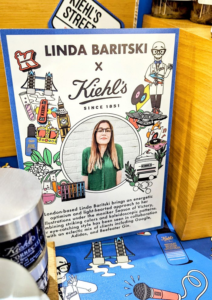
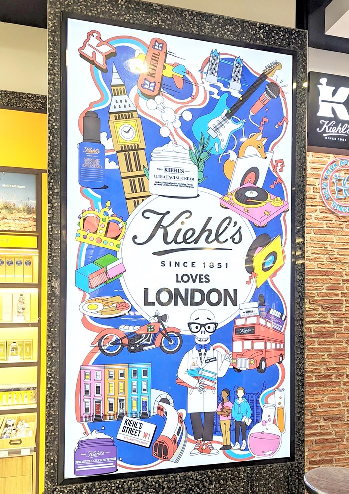
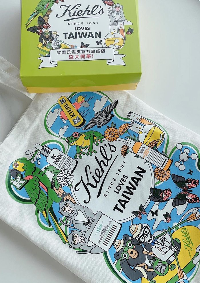
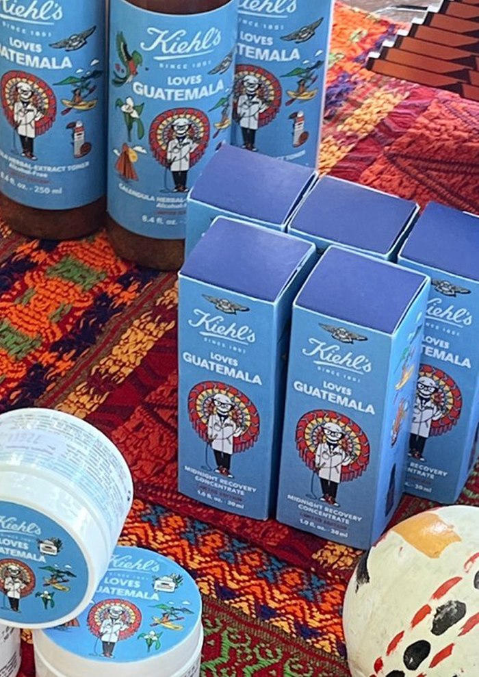
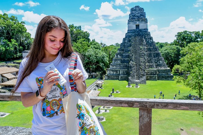
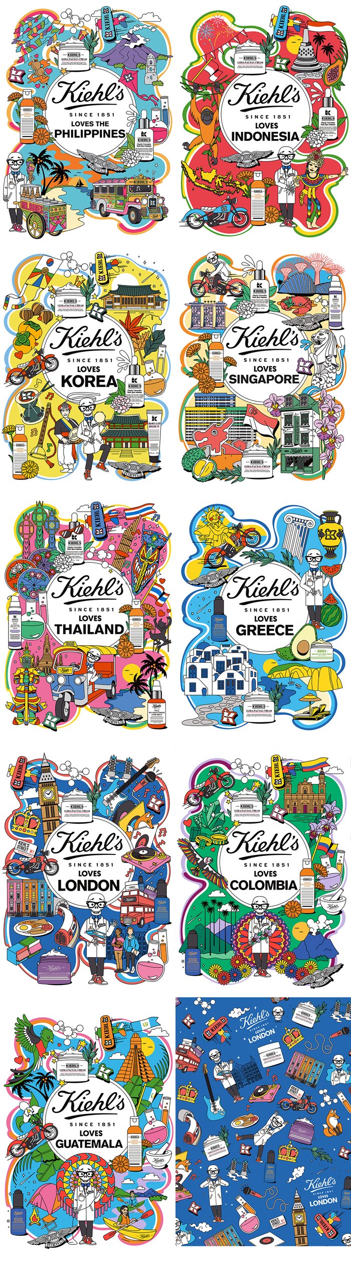
The London-based illustrator Linda Baritski – AKA Season of Victory – has recently completed a seven-month collaboration with the global skincare giant Kiehl’s. Graphic, colourful and eclectic, her illustrations are being rolled out at 48 Kiehl’s locations around the world, capturing the unique character of each outlet from China to Guatemala and from Britain to Japan.
Kiehl’s Loves x Linda Baritski is the latest in an ongoing series of collaborations with artists, and it demonstrates how powerful illustration can be – differentiating the brand and generating engagement with consumers from diverse backgrounds all over the world. Linda has crafted hundreds of illustrations, patterns and icons depicting a whole variety of people, landmarks, flora and fauna, food, musical instruments, historical artefacts, vehicles, maps, badges, flags and plenty more, all in her distinctive style.
“Working with Kiehl’s has been a dream collaboration of mine ever since I began as a freelance illustrator in 2017. I was a huge fan of their collaborations with some of my favourite artists including Aries Moross, Jeremyville and Ali Mac, so working on this project was amazing,” said Linda Baritski.
LOCAL FLAVOUR
Linda received a brief for each location including visual references and colour cues, then worked closely with the Kiehl’s creative leads. Local outlets around the globe passed on further details and background information on their stores, upcoming projects, promotions and special dates on their calendars.
Drawing on all of this for inspiration, Linda enjoyed full freedom to explore, carry out her own research and use her imagination to drive the imagery in her own directions. Through a creative process that involved three rounds of revisions, she rendered everything in her trademark style, emphasising the vibrant colour and energy of each location, with a touch of humour for good measure.
“I wanted to be helpful to each local market by also providing them with illustrated tool kits. Each included illustrated Kiehl's products, a character mini kit for the Kiehl's mascot, Mr Bones, in different poses and expressions, icons and a variety of patterns specific to the local market,” said Linda Baritski.
FRESH AND DIFFERENT
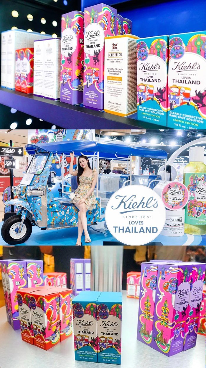
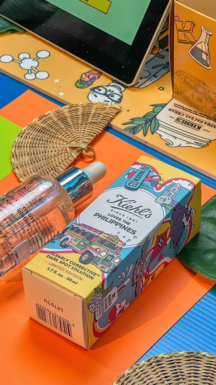
In front window displays, exclusive product packaging and point of sale displays, Linda’s artwork gives Kiehl’s shops a whole new feel – something fresh and different to surprise and delight their customers. In Thailand, a tuk-tuk has been painted from top to bottom with Linda’s eye-catching icons and characters, with more surprises on the way from locations all over the world.

POS in Thailand, London, Vietnam & Japan
“Thailand is definitely a big favourite for me – I'm hoping to see some of the artwork on products when I visit there at the end of the year. Paris had a lot of iconic imagery. Hainan was the first so it’s another favourite. I loved the unique cultural elements of the South American countries Guatemala, Puerto Rico and Panama. I really had a chance to be very colourful with them,” says Linda Baritski.
THE CREATIVE PROCESS
With so many illustrations to create, one of the biggest challenges was to keep organised while at the same time pushing the creativity at every opportunity. Often, Linda was working on a cycle, simultaneously starting new artworks, receiving local feedback on works in progress, and making corrections.
To keep on track she streamlined her process, which usually involves rounds of sketching and refinement. Because of the tight schedule, and confident in her ideas, for this project Linda normally went straight to drawing vector imagery in Adobe Illustrator. However, she was always careful to handle all cultural imagery sensitively, following advice from the local outlets.

Packaging in Japan, Taiwan, Thailand & Greece
“Because I've had experience working with clients from many different countries and cultures, I'm always respectful of their input when it comes to imagery and I'm always open to include or remove something. I also understood the sense of pride each country would have for many of the elements so wanted to represent them with respect but still reflect things in a vivid, lively style,” says Linda Baritski.