;}.cls-3{fill:url(%23linear-gradient);}.cls-4{fill:%23ce0e2d;}.cls-5{fill:%23101820;}%3c/style%3e%3cclipPath%20id='clip-path'%3e%3cpath%20class='cls-1'%20d='M282.6,25.89c-.87,1.36-3,4.13-.22,6.92,3.29,3.31,7.16.83,8.43-.29s7.1-6.57,7.1-6.57,5.82,5.52,6.86,6.45,4.7,3.77,8.15.41c2.69-2.81,1-5.82.06-7-.68-.84-15.12-17.17-15.12-17.17S283.21,25,282.6,25.89'/%3e%3c/clipPath%3e%3clinearGradient%20id='linear-gradient'%20x1='-102'%20y1='1334.99'%20x2='-100.27'%20y2='1334.99'%20gradientTransform='matrix(0,%2022.78,%2022.78,%200,%20-30113.3,%202332.13)'%20gradientUnits='userSpaceOnUse'%3e%3cstop%20offset='0'%20stop-color='%23ce0e2d'/%3e%3cstop%20offset='0.21'%20stop-color='%23ce0e2d'/%3e%3cstop%20offset='0.65'%20stop-color='%23fac5bd'/%3e%3cstop%20offset='1'%20stop-color='%23fac5bd'/%3e%3c/linearGradient%3e%3c/defs%3e%3ctitle%3eillustrationx%3c/title%3e%3cg%20id='Layer_2'%20data-name='Layer%202'%3e%3cg%20id='Layer_1-2'%20data-name='Layer%201'%3e%3cg%20class='cls-2'%3e%3crect%20class='cls-3'%20x='279.61'%20y='8.61'%20width='36'%20height='27.56'/%3e%3c/g%3e%3cpath%20class='cls-4'%20d='M313.42,1.66C310.14-1.65,306.26.83,305,2s-7.1,6.56-7.1,6.56S292.07,3,291,2.07s-4.71-3.77-8.16-.41c-2.69,2.81-1,5.82-.05,7,.68.84,15.11,17.16,15.11,17.16S312.6,9.51,313.2,8.57c.87-1.35,3-4.12.22-6.91'/%3e%3cpath%20class='cls-5'%20d='M167.35,11.89l4.49,9.61h-9Zm8.81,18.82H181L167.33,3.32,153.48,30.71h5l2.59-5.6,12.42,0Zm77.7-16.81v17h-4.39V3.67l20.08,17.86V4.16h4.37V31.25L253.86,13.46Zm-14.21,3.66a9.68,9.68,0,1,1-19.36,0,9.68,9.68,0,1,1,19.36,0m4.22,0c0-7.57-5.36-13.74-13.92-13.74S216.09,10,216.09,17.51,221.4,31.25,230,31.25s13.92-6.2,13.92-13.69M205.8,4.16h4.39V30.88H205.8Zm-13.5,4H200v-4h-19.8l0,4H188V30.88h4.34Zm-59.11,8.2h4.43c2.83,0,4.72-1.35,4.72-4.13s-1.89-4.13-4.72-4.13h-4.43Zm12.43,14.52-8.2-10.65h-4.23V30.88H128.8V4.16h8.48c5.77,0,9.51,2.92,9.51,8.08,0,3.77-1.82,6.27-5,7.37l9.16,11.28ZM115.3,8.17H123v-4h-19.8l0,4H111V30.88h4.34Zm-51.69,23c-7.63,0-11.55-5-11.55-13.19V4.16h4.09V18c0,5.84,2.34,9.12,7.46,9.12s7.45-3.28,7.45-9.1V4.16H75.2V18c0,8.16-4,13.17-11.59,13.17m-30.07-.32H48.71v-4H37.91l0-22.72H33.54ZM12.21,4.16H16.6l0,22.72h10.8v4H12.21ZM0,30.88H4.39V4.16H0ZM90.27,7.69c-2.71,0-4.46,1.46-4.44,3.63,0,1.9,1.23,3.11,3.89,3.87l2.86.81c4.4,1.22,6.69,3.73,6.7,7.52,0,4.5-3.77,7.67-8.92,7.69a12.6,12.6,0,0,1-9.73-4.27l3.23-2.42a9.12,9.12,0,0,0,6.53,2.88c2.74,0,4.5-1.54,4.53-3.79,0-2.05-1.17-3.16-4-4l-2.64-.78c-4.46-1.29-6.78-3.81-6.8-7.55C81.42,7,85,3.83,90,3.79a11.27,11.27,0,0,1,9.18,4.38L96,10.4a8,8,0,0,0-5.76-2.71'/%3e%3c/g%3e%3c/g%3e%3c/svg%3e)
Connecting You to a World of Illustration
Written by Garrick Webster
The Irish Examiner is a leading media brand in Ireland. To capitalize on its reputation for reliable reporting and knowledgeable analysis, the paper’s agency Chemistry has produced a campaign using four striking illustrations by Bob Venables that expertly fuse themes of both tradition and modernity. The images have been used in print, online, social and outdoor media to help reinforce the Examiner’s position as the country’s oldest established newspaper and a trustworthy companion for readers. The paper hasn’t changed, and it’s still doing what it does best.
Going to press!
One of the key challenges first of all was the tight deadline. Bob painted the four images over an eight-day period. “Fortunately, I work digitally,” says the artist, who is based on the Isle of Wight. “That’s why I can paint them that quickly. Painting them like I used to paint in oils would have taken a week for each image but with Photoshop and a Wacom Cintiq you can literally paint onto the screen and make changes quite easily.”
The quick turnaround didn’t diminish the quality of Bob’s art. He can work in a range of painterly styles, and using the software was able to convey a traditional oil painting look and feel with hand-painted brushstrokes, applying it to content symbolising the changes that have taken place in Irish culture, economics and politics over the last century or so.
Nostalgic and thoughtful
Bob’s style was part of his appeal to Chemistry, as well as the fact that he’d previously created a series to help promote The Irish Examiner’s coverage of the Gaelic Athletics Association Championships during the summer. That campaign won a Kinsale Shark silver award in the outdoor category. While the GAA work was a retro, comical take on the sports involved, his new campaign for the Examiner is similarly nostalgic but a little more thoughtful.
“Having worked with Bob before, we knew how talented he was and we felt that his particular style would be suitable again,” says Orla Kennedy, account manager at Chemistry in Dublin. “His level of detail is second to none and with some of the pieces in the campaign we needed that extra bit of detail to make sense of what we wanted to convey.”
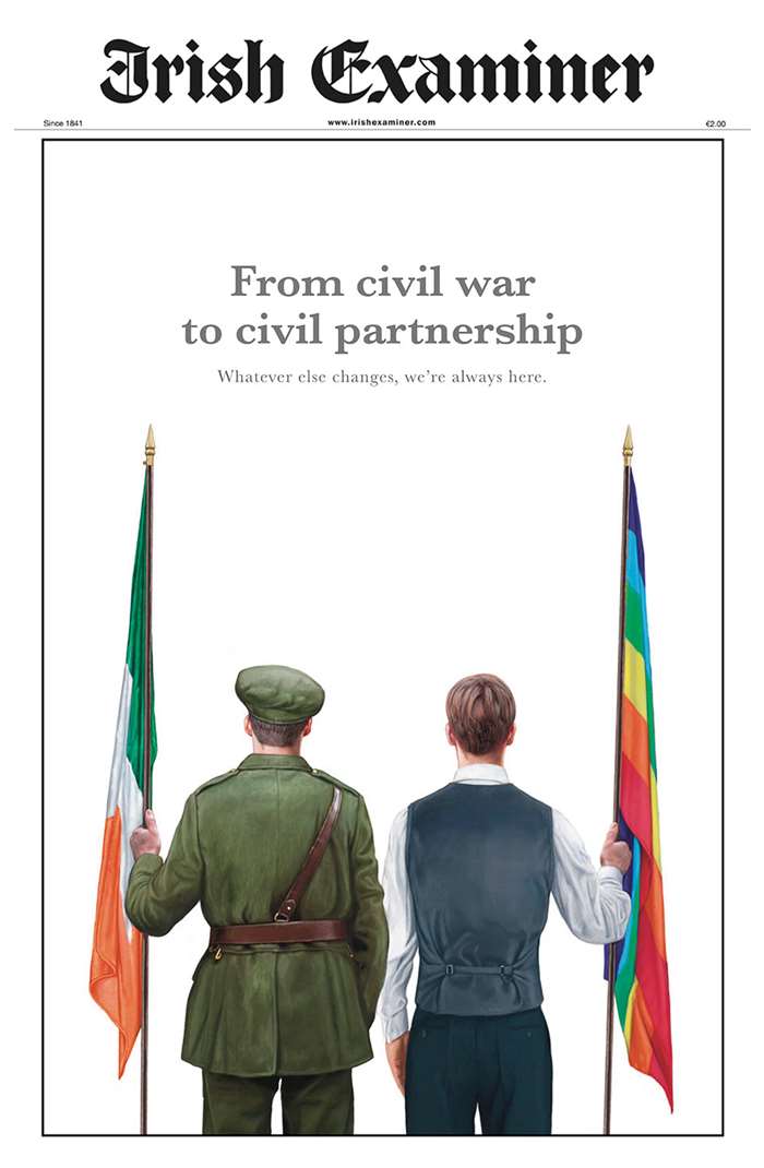
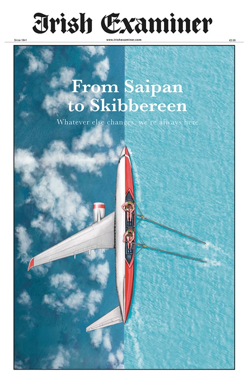
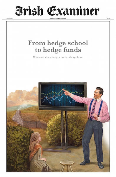
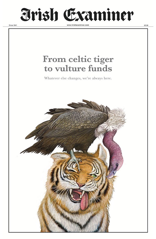
The concept was to juxtapose major events from Ireland’s past with recent issues, highlighting the continuity of the brand and its approach to reporting. The secondary tagline ‘Whatever else changes, we’re always here’ remained consistent across the posters, while the other main lines hit the key topical notes – from civil war to civil partnerships, from Celtic tiger to vulture funds, from hedge schools to hedge funds and from Saipan to Skibbereen.
Illustration makes an impact
Because of how the images would be used, it was important for them to be clear and straightforward, using the composition to make an impact. “They had to be readable immediately,” explains Bob. “Although they will be in the newspaper where somebody can ponder the picture, if you’re driving past a poster on a bus stop it’s got to be eye catching, and have instant impact.”
The civil war soldier and the LGBTQ campaigner side-by-side were clear and impactful, but getting a vulture pecking at a tiger right was a little trickier and Bob amended his sketch to make sure the final painting made sense at a glance. “I changed it so there was a space between the vulture’s head and the tiger’s ear, so that you’d see the silhouette clearly if you were passing it on the street. His head was actually going over the ear and they were melding in but we wanted to be able to see the vulture’s ugly neck. It’s a little exaggerated, it’s not as the neck would really be, but it gives you the idea quickly,” explains Bob.
Bob also made the hedge fund manager look a little more like a Wall Street man, based on feedback from Chemistry. This was also his favorite image because it includes a personal touch. “I adapted a picture of my daughter to go into that one. I had to make her look a bit younger, but she’s in there and I think she quite likes it. Throughout my work friends and family appear, though they don’t always realize it,” he says.
“With this campaign we didn’t have much feedback for Bob in terms of changing the imagery that drastically,” adds Orla. “It was more to finesse certain elements, for example fluffing up the hair on the tiger or adding more texture to the army uniform. This is another reason why we love to work with Bob as he really understands a brief once it’s been given.”