Connecting You to a World of Illustration
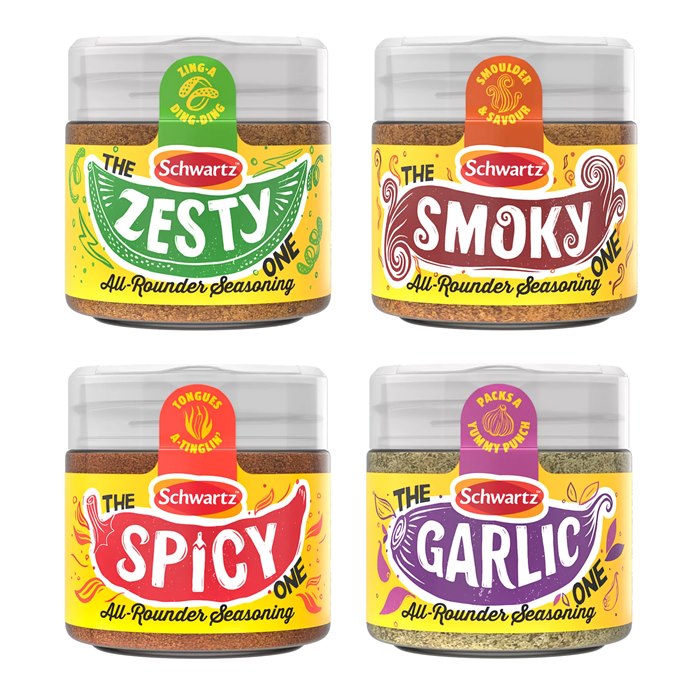
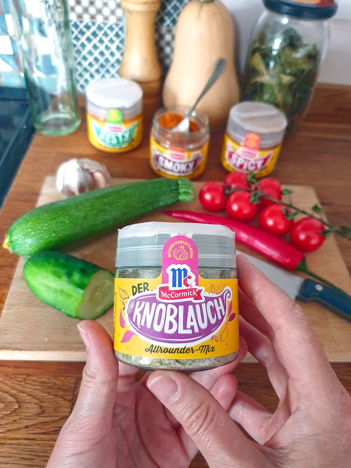
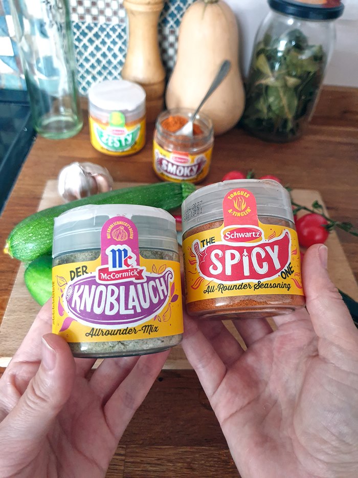
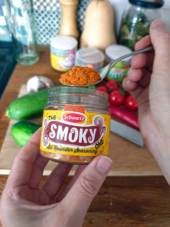
Becca’s commission for Schwartz captures the essence of four versatile seasoning blends through playful hand-lettered illustrations that reflect each blend’s personality.
Working closely with the brand, she also adapted the designs for McCormick’s German-language editions, ensuring the artwork retained its charm across markets. The labels combine eye-catching typography with rich, linocut imagery, complementing the products’ culinary versatility.
The project highlights Becca’s skill in marrying creative lettering with commercial packaging, delivering work that’s as functional as it is visually engaging.
Check them out here.