
Connecting You to a World of Illustration


Try our AI-assisted Search
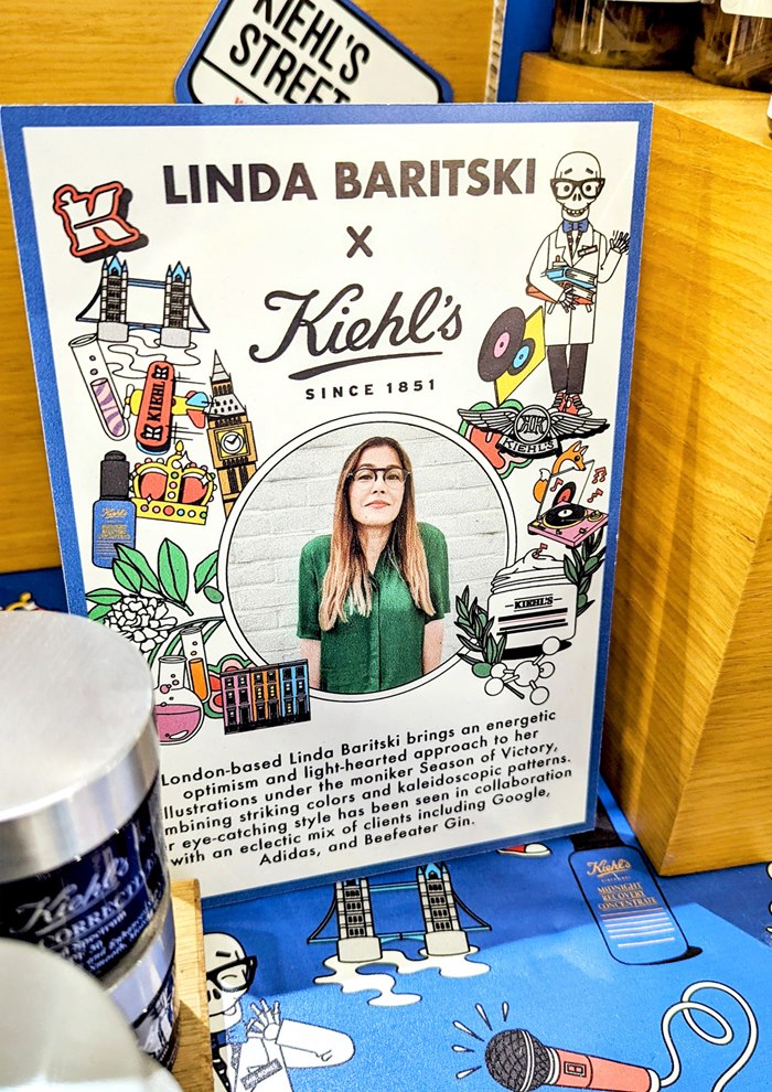
Part 2: Written by Garrick Webster
The London-based illustrator Linda Baritski has recently completed a seven-month collaboration with the skincare company, Kiehl’s. As the latest Kiehl’s Loves illustrator, she has created bespoke artwork for 48 Kiehl’s locations around the world, emphasising distinctive aspects of local culture in her vibrant, graphical and eclectic style.
In the following interview, the artist talks about how the project came about, her creative process and the challenges of tackling such an extensive and varied project.
When and how did the job come about?
Back in April 2021, Travis Cain, the Kiehl’s creative VP at the time, emailed me to see if I wanted to do a test for a Kiehl's Loves project. I was already a huge fan of the company’s use of illustration in marketing and packaging and was familiar with past versions of the campaign, so it was a huge ‘YES’.
What were the next steps?
The test version had a very tight turnaround but was exciting to create. I was asked to create a portrait illustration representing Hainan, in China, which turned out to be one of my favourite illustrations from the project now that it’s complete. After I was chosen for the project, we treated each location as a separate client.
What did this opportunity mean to you?
Working with Kiehl's has been a dream collaboration for me ever since I began as a freelance illustrator in 2017. I was a huge fan of their collaborations with some of my favourite artists and illustrators such as Craig & Karl, Peter Max, Aries Moross, Jeremyville, Simone Massoni and Ali Mac so working on this project was amazing. When I first signed with IllustrationX back in 2018, I actually wrote in the intro questionnaire that Kiehl's would be a dream client.
How did you approach the artwork?
For each location, I was given a visual brief of interesting cultural references to choose from. Some locations had specific colours or one specific ground colour they preferred while others left that up to me. The local markets provided more details and background information that helped me understand their specific projects and how the imagery would be used to highlight certain dates or projects throughout the year.
Everything else was open! The brief for each country/city would vary – some were more specific about imagery and colour, while others were very open, allowing me to decide what imagery to develop from their list of possibilities. I researched a bit more about each, mostly out of curiosity.
What kind of look and feel were you going for?
I was a huge fan of their past projects with illustrators – they had a lot of energy, a bit of humour and vibrant colour but they always allow each illustrator's unique style to shine too.
What media do you use, and what is your process?
Usually I sketch first – just rough notes and ideas. Then I create tighter sketches on my iPad before finalising in Adobe Illustrator. For this project, because of our tight schedule, I went straight to vector to save time and any adjustments were made in the revision rounds.
What feedback and amends did you receive during the process?
For each location, we had three rounds of revisions. As I was starting on some illustrations, I was working on corrections for others. Each location had a different consumer so their feedback was important and then I would interpret it in a playful way.
Were there any happy accidents along the way?
For each illustration, I went through a weird process of coming to a point where I felt like it wasn't going to work. Then, usually late at night, it would suddenly come together for me visually.
Which was your favourite and why?
Thailand is definitely a big favourite for me – I'm hoping to see some of the artwork on products when I visit there at the end of the year. Paris had a lot of iconic imagery. Hainan was the first one for the project, so another favourite. I also loved the unique cultural elements of the South American countries – Guatemala, Puerto Rico, Panama. I really had a chance to be very colourful with them.
Who’s the skeleton character in each illustration?
Mr Bones! If you visit any Kiehl's shop there's a Mr Bones dressed in glasses, a bow tie and a lab coat. Every illustrator who has worked with Kiehl's has created their version of Mr Bones. When I created mine, I used some of my background in working with character art and licensing to make a mini character kit. I created several expressive heads and body poses, icons and a variety of patterns specific to the local market
Spanning seven months and more than 40 locations, what were the main challenges you faced?
Because there were so many locations involved and three rounds of revisions for each, we had to keep very organised. There's an old-fashion belief that creatives should be messy and unorganised, but you can't be with a project this size. My painting area is another story, though!
Luckily, I was working with Emanuel Brown at Kiehl’s throughout and we were both methodical. Some weeks, when things were in review with the clients, I had time to do other projects or work on my paintings and take a rest from computer work. Other weeks, lots of feedback came through so scheduling was tighter. After the project ended, I took a month off and just relaxed and went on holiday! It was intense for those seven months but really fun as an illustrator.
It's definitely the biggest project I’ve worked on as a freelancer, but I've worked on projects at this scale in past jobs so understood what was involved.
How did you ensure cultural references were handled sensitively?
I think because I've had experience working with clients from many different countries and cultures, I'm always respectful of their input when it comes to imagery and I'm always open to include or remove something. I also understood the sense of pride each country would have for many of the elements so wanted to represent them with respect but still reflect things in a vivid, lively style.
What’s next for Linda Baritski?
I'm working on a few client projects between now and the end of the year and spending time painting a bit more and creating some personal projects. I'd love to collaborate on installation projects or site-specific projects, indoor or outdoor, or skin a bus, car or plane with my illustrations. Or maybe work with a beverage company on their next campaign. I would love to work on another project this size again.
Who are your main influences?
Patrick Caufield, psychedelic artwork, Peter Max, Pop Art, John Alcorn, Milton Glaser and Tadanori Yokoo.
Read part 1 of this feature here.