
Connecting You to a World of Illustration
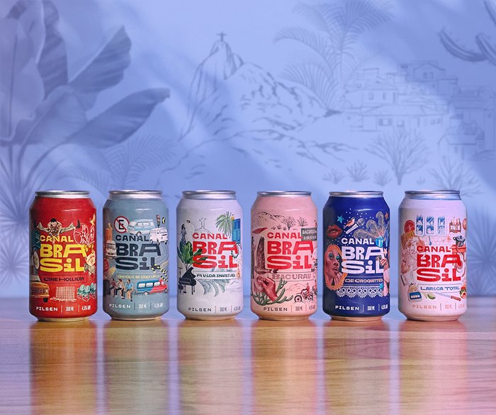
Based in São Paulo, illustrator Débora Islas is the artist behind a colourful series of promotional beer labels created for the Brazilian broadcaster Canal Brasil. Each with a montage of realistic retro imagery, the illustrations celebrate the channel’s 25th anniversary by spotlighting Canal Brasil’s most popular films and TV shows across six cans.
We asked Débora to take us behind the scenes on her creative process, the challenges she faced and what inspired her as she sketched the elements for each artwork.
When and how did the job come about?
In late April 2023, Canal Brasil’s marketing coordinator contacted me to say that in September they would be celebrating their 25th anniversary and that the team was looking for artists to create the labels for specialty beer cans. I introduced them to Ana Bandarra at my agency, IllustrationX, and we set up a meeting.
What was the brief?
Initially, the client asked for an internal key visual on the theme of Brazilian cinema as a test of style and creativity. I had total artistic freedom apart from one requirement – the image had to include a bem-te-vi, the Latin American bird the channel uses as its mascot. Other artists were also pitching for the commission. I was offered the brief, submitted my first sketches in June, the films to be represented on the cans were chosen, and the project moved to completion in August.
How did the key visual lead to the full project?
In my concept, there were representations of 10 Brazilian films, which I chose myself. With the visual language approved, the scope included six cans, each on a different Canal Brasil film or TV show. But during the process, I studied more titles, which were discarded for internal reasons.
How did you approach the artwork?
The team provided all the films for me to watch. I watched them, even those I’d already seen, because I needed to carefully choose the elements that stood out. I paused the videos and took notes on every detail. For some items, I had to research further by finding photographic references with good angles, such as the cars that appear on the Choque de Cultura can. The process also included testing colour palettes that referenced the productions but were harmonious. Brazil is very large and diverse, and the artwork represents this variation in themes, environments and characters well.
What kind of look and feel were you going for?
I tried to find graphic resources that would make it possible to adapt the layout to different formats and a language that would fit in with the brand's visual identity. The Canal Brasil logo has letters that fit together and occupy different widths. I went for realism mixed with simple strokes and contours with a wealth of textures.
What media do you use, and what is your process?
I created sketches based on the layout of the packaging to establish the entire composition. All the painting and finishing was done in Photoshop on separate layers.
What feedback and amends did you receive during the process?
The main thing the client fed back on was the depiction of the characters. I couldn’t show their faces but had to convey their identities. Characterisation was focused on attitude, body type and clothing. We worked together on the creation of the cans for the Larica Total and Choque de Cultura programmes. The feedback led to richer detail in the imagery.
Were there any happy accidents along the way?
No, but in the same week that I watched all the films, I had to update the electrical system in my apartment and it was a bit chaotic setting up a place to put the computer while electricians pulled wires from all the walls and ceilings. It was a challenge to concentrate.
Which was your favourite and why?
When the designs were complete, I couldn’t choose a favourite. I remember being very happy with A Vida Invisível. It’s the second time I’ve illustrated the movie. The first was in 2019 when I was invited to join an exclusive campaign with the brand Chico Rei. I had to watch the film and create a t-shirt print, with the money raised going to social causes.
Did any other artists influence how you created the project?
For this project, I had some very inspiring influences: Berto Martinez, whose hand-drawn compositions are full of information; Maria Gabriela, who illustrates Brazilian themes full of foliage and birds; and Alan Berry Rhys, who has a background in graphic design and whose style is reminiscent of old advertising prints.
What’s next for Débora Islas?
The end of this year promises to be busy. I have some works in progress but can’t give any more details yet. I plan to license some of my artworks. I’ve received a few proposals for these illustrations to be turned into various products and I’m excited about the possibility!
Read part 1 of this feature here.


